CometChatGroups component displays a searchable list of groups, enabling users to browse, join, and interact with group conversations.
Prerequisites
Before using this component, ensure you have:- Completed Getting Started setup
- User logged in with
CometChatUIKit.login() - At least one group created in your CometChat dashboard
Usage
Basic Implementation
Display a groups list and open messages when a group is tapped:Production Implementation
Complete implementation with selection mode, error handling, and navigation:Actions
Actions let you customize component behavior through callbacks.| Action | Description |
|---|---|
set(onItemClick:) | Triggered when a group is tapped |
set(onItemLongClick:) | Triggered on long press |
set(onBack:) | Triggered when back button is pressed |
set(onSelection:) | Triggered when groups are selected (selection mode) |
set(onError:) | Triggered when an error occurs |
set(onEmpty:) | Triggered when the list is empty |
set(onLoad:) | Triggered when groups are loaded |
Filters
Filter the groups list usingGroupsRequestBuilder.
| Method | Type | Description |
|---|---|---|
setLimit | Int | Maximum groups per request |
setSearchKeyword | String | Filter by search term |
joinedOnly | Bool | Show only joined groups |
setTags | [String] | Filter by tags |
withTags | Bool | Include tag information |
Show Only Joined Groups
Search Groups
Filter by Tags
Events
Listen for group-related events across your app.| Event | Description |
|---|---|
onGroupCreate | Group was created |
onGroupDelete | Group was deleted |
onGroupMemberJoin | User joined a group |
onGroupMemberLeave | User left a group |
onGroupMemberAdd | Members were added |
onGroupMemberBan | Member was banned |
onGroupMemberUnban | Member was unbanned |
onGroupMemberKick | Member was kicked |
onGroupMemberChangeScope | Member scope changed |
onOwnershipChange | Group ownership transferred |
Add Event Listener
Emit Events
Styling
Customize the appearance usingGroupsStyle.
Global Styling
Apply styles to allCometChatGroups instances:
Instance Styling
Apply styles to a specific instance: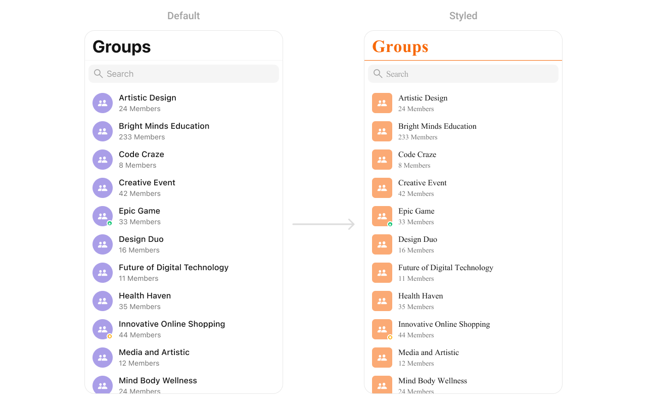
Style Properties
| Property | Description | Code |
|---|---|---|
listItemSelectedImage | Check box image when a list item is selected | listItemSelectedImage |
listItemDeSelectedImage | Check box image when a list item is deselected | listItemDeSelectedImage |
searchIconTintColor | Tint color for the search icon | searchIconTintColor |
searchBarStyle | Style of the search bar | searchBarStyle |
searchTintColor | Tint color for the search bar | searchTintColor |
searchBarTintColor | Background color of the search bar | searchBarTintColor |
searchBarPlaceholderTextColor | Placeholder text color for the search bar | searchBarPlaceholderTextColor |
searchBarPlaceholderTextFont | Font for the placeholder text in the search bar | searchBarPlaceholderTextFont |
searchBarTextColor | Color of the text entered in the search bar | searchBarTextColor |
searchBarTextFont | Font for the text in the search bar | searchBarTextFont |
searchBarBackgroundColor | Background color of the search bar | searchBarBackgroundColor |
searchBarCancelIconTintColor | Tint color for the cancel icon in the search bar | searchBarCancelIconTintColor |
searchBarCrossIconTintColor | Tint color for the cross icon in the search bar | searchBarCrossIconTintColor |
backgroundColor | Background color of the overall view | backgroundColor |
borderWidth | Width of the border around the view | borderWidth |
borderColor | Color of the border around the view | borderColor |
cornerRadius | Corner radius settings for the view | cornerRadius |
titleColor | Color for the title text | titleColor |
titleFont | Font used for the title text | titleFont |
largeTitleColor | Color for the large title text | largeTitleColor |
largeTitleFont | Font used for the large title text | largeTitleFont |
navigationBarTintColor | Background color of the navigation bar | navigationBarTintColor |
navigationBarItemsTintColor | Tint color for items in the navigation bar | navigationBarItemsTintColor |
errorTitleTextFont | Font used for the error title text | errorTitleTextFont |
errorTitleTextColor | Color of the error title text | errorTitleTextColor |
errorSubTitleFont | Font used for the error subtitle text | errorSubTitleFont |
errorSubTitleTextColor | Color of the error subtitle text | errorSubTitleTextColor |
retryButtonTextColor | Color for the retry button text | retryButtonTextColor |
retryButtonTextFont | Font used for the retry button text | retryButtonTextFont |
retryButtonBackgroundColor | Background color for the retry button | retryButtonBackgroundColor |
retryButtonBorderColor | Border color for the retry button | retryButtonBorderColor |
retryButtonBorderWidth | Width of the border around the retry button | retryButtonBorderWidth |
retryButtonCornerRadius | Corner radius settings for the retry button | retryButtonCornerRadius |
emptyTitleTextFont | Font used for the empty state title text | emptyTitleTextFont |
emptyTitleTextColor | Color of the empty state title text | emptyTitleTextColor |
emptySubTitleFont | Font used for the empty state subtitle text | emptySubTitleFont |
emptySubTitleTextColor | Color of the empty state subtitle text | emptySubTitleTextColor |
tableViewSeparator | Color of the table view separator | tableViewSeparator |
listItemTitleTextColor | Color of the title text in list items | listItemTitleTextColor |
listItemTitleFont | Font used for the title text in list items | listItemTitleFont |
listItemSubTitleTextColor | Color of the subtitle text in list items | listItemSubTitleTextColor |
listItemSubTitleFont | Font used for the subtitle text in list items | listItemSubTitleFont |
listItemBackground | Background color for list items | listItemBackground |
listItemSelectedBackground | Background color for list items if selected | listItemSelectedBackground |
listItemBorderWidth | Width of the border around list items | listItemBorderWidth |
listItemBorderColor | Color of the border around list items | listItemBorderColor |
listItemCornerRadius | Corner radius settings for list items | listItemCornerRadius |
listItemSelectionImageTint | Tint color for the selection image in list items | listItemSelectionImageTint |
listItemDeSelectedImageTint | Tint color for the deselected image in list items | listItemDeSelectedImageTint |
passwordGroupImageTintColor | Tint color for the password group image | passwordGroupImageTintColor |
passwordGroupImageBackgroundColor | Background color for the password group image | passwordGroupImageBackgroundColor |
privateGroupImageTintColor | Tint color for the private group image | privateGroupImageTintColor |
privateGroupImageBackgroundColor | Background color for the private group image | privateGroupImageBackgroundColor |
privateGroupIcon | Image for a private group icon | privateGroupIcon |
protectedGroupIcon | Image for a protected group icon | protectedGroupIcon |
Functionality
Configure component behavior with these properties and methods:| Method | Description | Code |
|---|---|---|
set(groupsRequestBuilder:) | Sets the request builder for fetching groups | set(groupsRequestBuilder: requestBuilder) |
set(searchRequestBuilder:) | Sets the request builder for searching groups | set(searchRequestBuilder: searchRequestBuilder) |
set(searchKeyword:) | Sets the search keyword to filter groups | set(searchKeyword: "group_name") |
hideErrorView | Hides the error state view | hideErrorView = true |
hideNavigationBar | Hides or shows the navigation bar | hideNavigationBar = true |
hideSearch | Hides the search bar | hideSearch = true |
hideBackButton | Hides the back button | hideBackButton = true |
hideLoadingState | Hides the loading state indicator | hideLoadingState = true |
hideReceipts | Hides message read/delivery receipts | hideReceipts = true |
hideDeleteConversationOption | Hides the option to delete a conversation | hideDeleteConversationOption = true |
hideUserStatus | Hides the online/offline status of users | hideUserStatus = true |
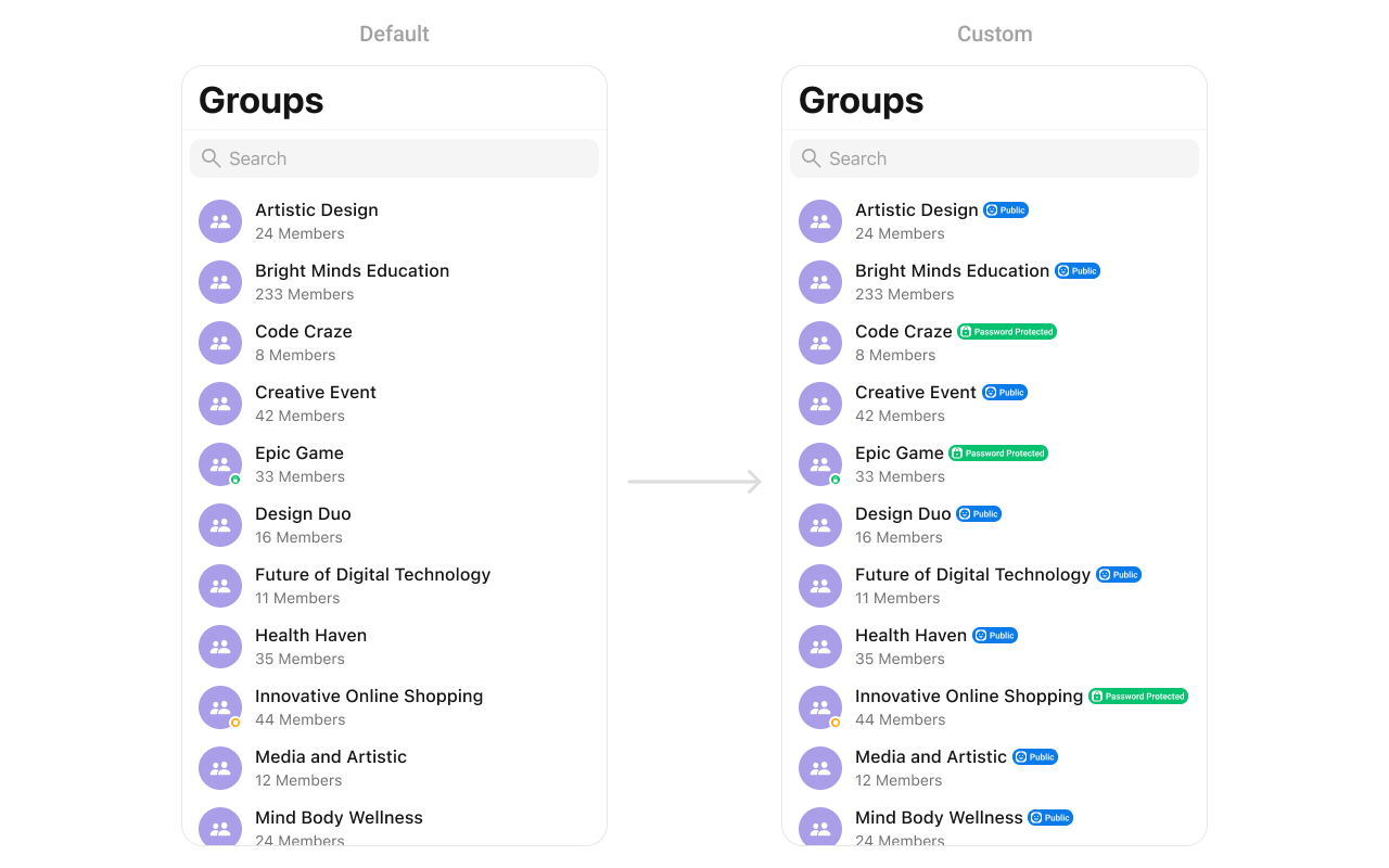
hideGroupType | Hides the group type (private/public) | hideGroupType = true |
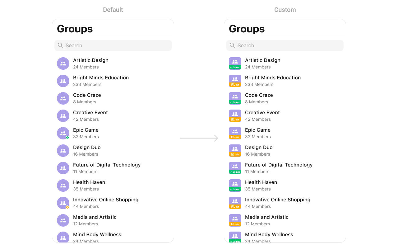
Custom Views
SetOptions
You can define custom options for each group using.set(options:). This method allows you to return an array of CometChatGroupOption based on the group object.
AddOptions
You can dynamically add options to groups using.add(options:). This method lets you return additional CometChatGroupOption elements.
SetListItemView
With this function, you can assign a custom ListItem to the groups Component.Custom List Item
Replace the default group cell with a custom view: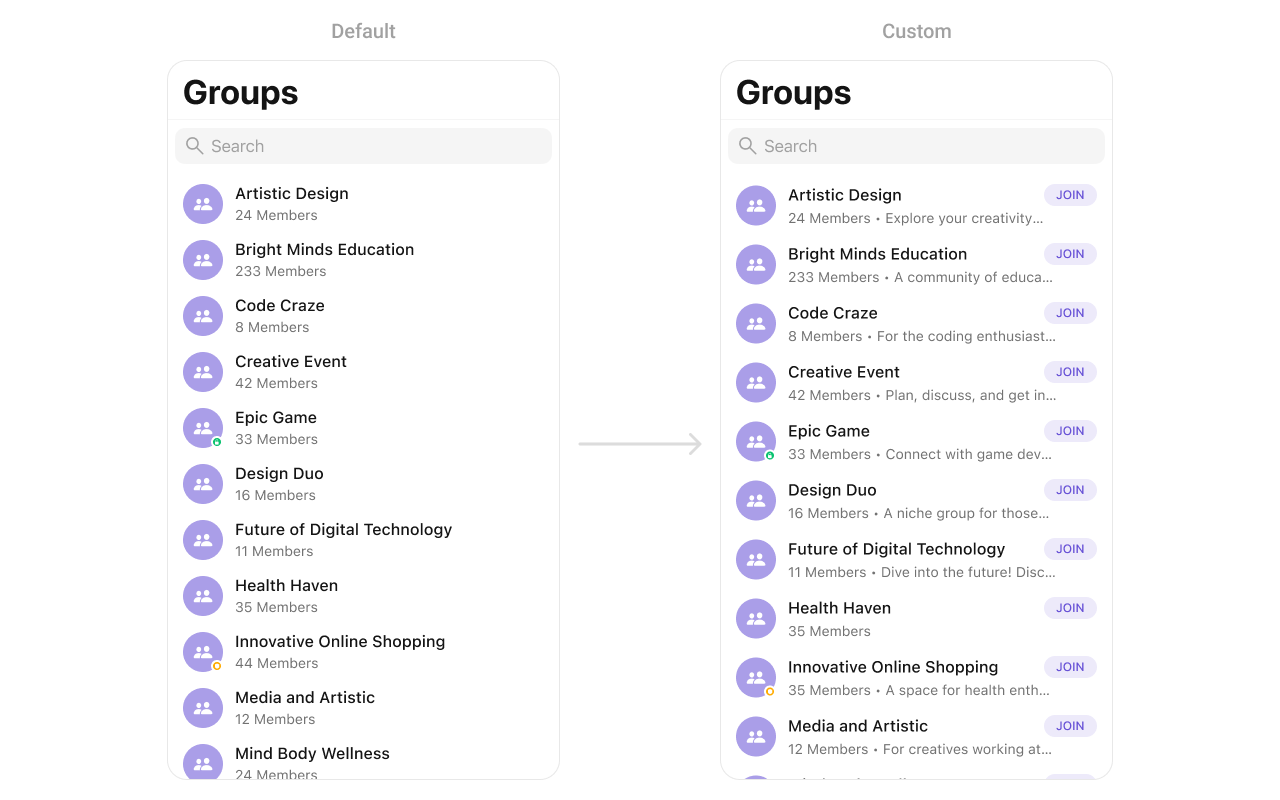
SetLeadingView
You can modify the leading view of a group cell using.set(leadingView:).
CustomLeadingView as a custom UIView. Which we will inflate in setLeadingView():
SetTitleView
You can customize the title view of a group cell using.set(titleView:).
CustomTitleView as a custom UIView. Which we will inflate in setTitleView():
SetTrailView
You can modify the trailing view of a group cell using.set(trailView:).
CustomTrailView as a custom UIView. Which we will inflate in setTrailView():
SetSubTitleView
You can customize the subtitle view for each group item to meet your requirements:
CustomSubtitleView UIView file into the .set(subtitleView:) method within CometChatGroups:
SetLoadingView
You can set a custom loading view using.set(loadingView:). This method accepts a UIView to display while data is being fetched.
SetErrorView
You can customize the error view using.set(errorView:). This method accepts a UIView that appears when an error occurs.
SetEmptyView
You can customize the empty state view using.set(emptyView:). This method accepts a UIView that appears when no groups are available.
Group Options
Add custom swipe actions to group cells.Set Options
Replace default options:Add Options
Add options to existing ones:Component Structure
| Component | Description |
|---|---|
| CometChatListBase | Container with navigation bar and search |
| CometChatListItem | Individual group cell |
Troubleshooting
| Issue | Solution |
|---|---|
| Groups not loading | Verify user is logged in and has proper permissions |
| Search not working | Check searchRequestBuilder configuration |
| Events not firing | Ensure listener is added before actions occur |
| Styling not applied | Apply styles before presenting the component |
| Custom views not showing | Return non-nil UIView from closure |
Related Components
- Group Members - Display group member list
- Conversations - Display conversation list
- Users - Display user list